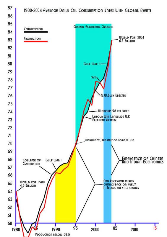
 by Gazzatrone » Mon 13 Nov 2006, 18:15:50
$this->bbcode_second_pass_quote('AirlinePilot', 'S')omeone please answer why consumption can be ahead of production so much on that chart. Is it possible that there were enough reserves in storage to account for this obvious anomaly?
Its just not intuitive to me. It almost seems like those two lines are labeled wrong. Very interested in why that is.
Well when I was doing the graph I put the Consumption rate in first. If you look at the title it just says Consumption rates. The Production line was a throw in as I have broken toes and am PC bound at home and was bored. I posted not realising I hadn't edited the title.
So trust me when I say I am not deliberately fabricating the data.
I was surprised when drawing out the Production line how far behind consumption production actual was.
Now admittedly this graph is based on average daily consumption/production rates but over all I believe they equal themselves out and you get a true picture. But it is interesting to note that for the majority of
both averages run a parallel course.


