One particular aspect of this site is the facts must be correct. You can bring up just about any topic that comes out of your brain, but if the facts are not accurate, you will be torn to shreds.
---
consider another graph with the oil data in relation to population. Oil production per capita will produce a curve with a much steeper slope.
From there, produce a graph of oil available on the export market per person in oil importing countries. a steeper slope still.
You might try to extrapolate the data into the future, but I think it will drop to zero when the markets crap out.


PeakOil is You
Dont worry, be happy
Re: Dont worry, be happy
![]() by kpeavey » Thu 22 Nov 2007, 07:00:26
by kpeavey » Thu 22 Nov 2007, 07:00:26
If you want a picture of the future, imagine a boot stamping on a human face--for ever."
-George Orwell, 1984
_____
twenty centuries of stony sleep were vexed to nightmare by a rocking cradle, and what rough beast, its hour come round at last, slouches towards Bethlehem to be born?
-George Yeats
-George Orwell, 1984
_____
twenty centuries of stony sleep were vexed to nightmare by a rocking cradle, and what rough beast, its hour come round at last, slouches towards Bethlehem to be born?
-George Yeats
-

kpeavey - Expert

- Posts: 1670
- Joined: Mon 04 Oct 2004, 03:00:00
Re: Dont worry, be happy
![]() by Heineken » Thu 22 Nov 2007, 10:27:25
by Heineken » Thu 22 Nov 2007, 10:27:25
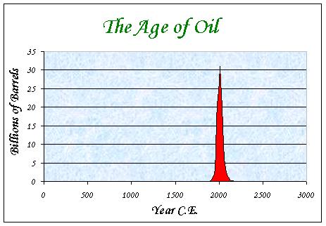
$this->bbcode_second_pass_quote('dohboi', 'D')id any one else notice that the year intervals along the bottom of spot's happy flat chart are a little...funny.
Though appearing to be equal segments, they actually vary from six year intervals to seven, to nine, to...zero!!
Yes, spot, you have 1986 (if I recall correctly) twice along the bottom of your graph. I don't know if it was intentional, but it sure helps flatten out the curve!
I'm not sure who should be more embarrassed: you for presenting such sloppy work, or the rest of us for not noticing such a basic gaff so far. Or maybe the other posters were just being polite?
Your basic point has been made many times on many threads here--it is hard to know exactly how long and how flat or bumpy the plateau will be, but there aren't a lot of positive signs that I can see. Maybe you can apply you're graphing skills to chart the price of a barrel of light sweet crude from 2000 to now in (regular!) two year intervals. I believe you will find that it approximates an exponential curve. That is closer to the reality we are in than a deceptively comforting flatish curve.
I didn't notice it. But when you mentally extract that bogus segment, the basic shape of the curve doesn't change much.
The key point is that spot's analysis is completely irrelevant. He's zeroed in on the production plateau, most of which is behind us, and claimed that since it's been fairly gentle, we can count on harmless times ahead. A least a good 40 fun years, or conveniently long enough for any of us now alive, including spot.
All plateaus are gentle. That's what a plateau is. It's the downslope, which we're fast approaching or actually now in, that matters. An entirely different animal colliding with the fully accelerated, grasping, dependent creature that a century of energy abundance has manufactured.
"Actually, humans died out long ago."
---Abused, abandoned hunting dog
"Things have entered a stage where the only change that is possible is for things to get worse."
---I & my bro.
---Abused, abandoned hunting dog
"Things have entered a stage where the only change that is possible is for things to get worse."
---I & my bro.
-

Heineken - Expert
- Posts: 7051
- Joined: Tue 14 Sep 2004, 03:00:00
- Location: Rural Virginia
Re: Dont worry, be happy
![]() by Twilight » Thu 22 Nov 2007, 17:03:29
by Twilight » Thu 22 Nov 2007, 17:03:29
$this->bbcode_second_pass_quote('dohboi', 'I')'m not sure who should be more embarrassed: you for presenting such sloppy work, or the rest of us for not noticing such a basic gaff so far. Or maybe the other posters were just being polite?
I'm not being polite. I said from the start the graph is bullshit, not what it claims to be at all. I'm going to say it a third time. The x-axis is wrong, the y-axis is wrong, and the shape is wrong. I don't know what data is represented, but it certainly is not world oil production.
- Twilight
- Expert
- Posts: 3027
- Joined: Fri 02 Mar 2007, 04:00:00
Re: Dont worry, be happy
![]() by cube » Thu 22 Nov 2007, 20:18:02
by cube » Thu 22 Nov 2007, 20:18:02
$this->bbcode_second_pass_quote('Twilight', '')$this->bbcode_second_pass_quote('dohboi', 'I')'m not sure who should be more embarrassed: you for presenting such sloppy work, or the rest of us for not noticing such a basic gaff so far. Or maybe the other posters were just being polite?
I'm not being polite. I said from the start the graph is bullshit, not what it claims to be at all.
My prediction is that as we get closer to PO there'll be even more bullshit. Eventually we'll reach peak bullshit and then the slope will go downhill as more and more "spin doctors" out there finally either see the truth or die-off.

- cube
- Intermediate Crude

- Posts: 3909
- Joined: Sat 12 Mar 2005, 04:00:00


