

PeakOil is You
[Charts] The World is Flat
Re: [Charts] The World is Flat
![]() by dcoyne78 » Wed 28 Aug 2013, 13:33:13
by dcoyne78 » Wed 28 Aug 2013, 13:33:13
$this->bbcode_second_pass_quote('ROCKMAN', 'K')eith – In another thread I was teasing one of our cohorts about using one decimal place in his estimate..
Yes that was me.
I stand by using two decimal places, despite what others think. I was taught that you want to present one extra decimal beyond where you are confident. The reasoning is simple. If his estimate was 2.49 or 1.51, Rockman would say his answer was 2, I believe it would convey more information to say 2.5 or 1.5, and allow the reader to realize that the estimate is between 1 and 2 or between 2 and 3. The idea is that by dropping too many decimal places you throw away valuble information ,YMMV.
DC
- dcoyne78
- Coal

- Posts: 476
- Joined: Thu 30 May 2013, 19:45:15
Re: [Charts] The World is Flat
![]() by TheDude » Wed 28 Aug 2013, 14:54:48
by TheDude » Wed 28 Aug 2013, 14:54:48
Hi Pops,
A long time ago I gave up on charting every last point, no one is really interested in how oil production in New Zealand is coming along, and adding it to a chart just pulls down the resolution; with your big graphs it's very hard to tell which nation is which, even the largest ones. The answer is to fold all the bit players into "others" or "minor producers" or "<100 kb/d" or whatever you please. Matt often has graphs of incremental production, where all nations shown start from a common point and the lines illustrate how they've evolved since that date, that's a nice way of teasing out growth. Also you can sort producers by size and then make dedicated graphs for groups of whatever size.
I've tried labels on charts but that gets messy pretty quickly too. Sometimes there's a way. Also I haven't really messed about with charts in a few years and the software is always getting better; and some programs are good for a certain approach, Excel has bubble charts for instance while Open/Libre Office don't...I think...IIRC. Like I said, been a while!
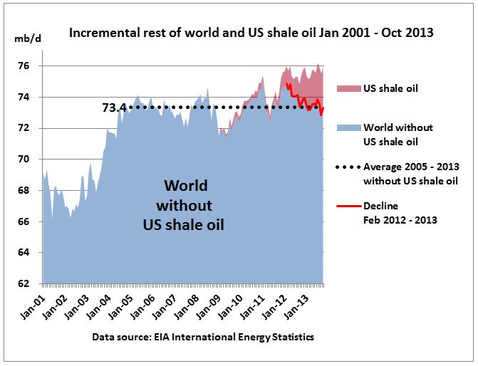
Stacked charts especially can be misleading here; I find it more instructive to show simple lines usually, and to make sure the Y axis has enough fine resolution to show what's going on. You could for instance set your Y from 70 to 75 mb/d with a 500 kb/d grid and neatly show how tight oil is pushing the world above 74 mb/d. Again, stacked graphs can lead one astray, is tight oil really what's pushing production up, or are other sources doing the grunt work? Showing YOY gains/losses with a Y of +/- of ca. 2 mb/d would illustrate who is actually contributing to any production gains, as well as who is falling behind.
A long time ago I gave up on charting every last point, no one is really interested in how oil production in New Zealand is coming along, and adding it to a chart just pulls down the resolution; with your big graphs it's very hard to tell which nation is which, even the largest ones. The answer is to fold all the bit players into "others" or "minor producers" or "<100 kb/d" or whatever you please. Matt often has graphs of incremental production, where all nations shown start from a common point and the lines illustrate how they've evolved since that date, that's a nice way of teasing out growth. Also you can sort producers by size and then make dedicated graphs for groups of whatever size.
I've tried labels on charts but that gets messy pretty quickly too. Sometimes there's a way. Also I haven't really messed about with charts in a few years and the software is always getting better; and some programs are good for a certain approach, Excel has bubble charts for instance while Open/Libre Office don't...I think...IIRC. Like I said, been a while!
Stacked charts especially can be misleading here; I find it more instructive to show simple lines usually, and to make sure the Y axis has enough fine resolution to show what's going on. You could for instance set your Y from 70 to 75 mb/d with a 500 kb/d grid and neatly show how tight oil is pushing the world above 74 mb/d. Again, stacked graphs can lead one astray, is tight oil really what's pushing production up, or are other sources doing the grunt work? Showing YOY gains/losses with a Y of +/- of ca. 2 mb/d would illustrate who is actually contributing to any production gains, as well as who is falling behind.
Cogito, ergo non satis bibivi
And let me tell you something: I dig your work.
And let me tell you something: I dig your work.
-

TheDude - Expert

- Posts: 4896
- Joined: Thu 06 Apr 2006, 03:00:00
- Location: 3 miles NW of Champoeg, Republic of Cascadia
Re: [Charts] The World is Flat
![]() by ROCKMAN » Wed 28 Aug 2013, 17:05:10
by ROCKMAN » Wed 28 Aug 2013, 17:05:10
DC - " I was taught that you want to present one extra decimal beyond where you are confident." And thus the subjectiveness: how do you know what your confidence level should be? Sometimes 2 + 2 = 1. And sometimes it's equal to 6. So if you confident it falls between 3 and 5 you could be very wrong.
Granted to a degree it's a silly point I'm making. But it my model you assume 2 = 2. But as I've pointed out sometimes production history proves that 2 doesn't always equal 2. Sometimes it's equal to 1...or less. So is 2 + 2 = to 4 if the first 2 is really 1 and the second 2 is equal to 2? In that case 2 + 2 = 3. Yes...silly. But as I explained: once 25 million bo was actually equal to 1 million bo and 125 bcf = 25 bcf. After 30 some years that one still leaves a bad taste in my mouth. LOL.
Granted to a degree it's a silly point I'm making. But it my model you assume 2 = 2. But as I've pointed out sometimes production history proves that 2 doesn't always equal 2. Sometimes it's equal to 1...or less. So is 2 + 2 = to 4 if the first 2 is really 1 and the second 2 is equal to 2? In that case 2 + 2 = 3. Yes...silly. But as I explained: once 25 million bo was actually equal to 1 million bo and 125 bcf = 25 bcf. After 30 some years that one still leaves a bad taste in my mouth. LOL.
-

ROCKMAN - Expert
- Posts: 11397
- Joined: Tue 27 May 2008, 03:00:00
- Location: TEXAS
Re: [Charts] The World is Flat
![]() by Keith_McClary » Thu 29 Aug 2013, 01:59:50
by Keith_McClary » Thu 29 Aug 2013, 01:59:50
$this->bbcode_second_pass_quote('Pops', '
')I refused? maybe we should review that.
Here's a chart of how little difference in peak a big difference in URR makes:

But I think the bigger point is not that a trillion barrels or 2 only makes a decade or 2 difference in the peak ...
Perfect - but I don't see it in "10 Basic Facts of Peak Oil".')I refused? maybe we should review that.
Here's a chart of how little difference in peak a big difference in URR makes:
But I think the bigger point is not that a trillion barrels or 2 only makes a decade or 2 difference in the peak ...
Facebook knows you're a dog.
-

Keith_McClary - Light Sweet Crude

- Posts: 7344
- Joined: Wed 21 Jul 2004, 03:00:00
- Location: Suburban tar sands
Re: [Charts] The World is Flat
![]() by Pops » Thu 29 Aug 2013, 08:25:22
by Pops » Thu 29 Aug 2013, 08:25:22
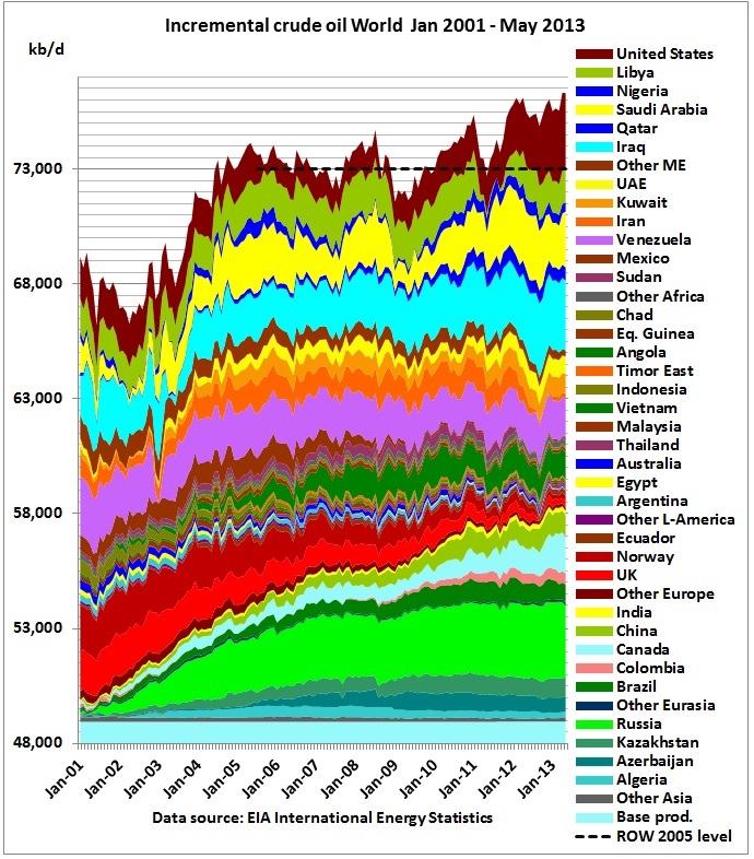
Thanks Dude, I was mainly trying to illustrate the long plateau and show the size relationship of US tight production to the total, the one showing only US tight and rest of world. I'm not as interested in the month to month or country by country as the larger picture.
I do like Matt's "incremental" charts that show just the change in production. For those who haven't been there it's www.crudeoilpeak.info
These are from open office, btw, which is becoming a pretty good alternative to msoffice, excel doesn't play well with my Mac, it has a problem with my font collection I think.
The legitimate object of government, is to do for a community of people, whatever they need to have done, but can not do, at all, or can not, so well do, for themselves -- in their separate, and individual capacities.
-- Abraham Lincoln, Fragment on Government (July 1, 1854)
-- Abraham Lincoln, Fragment on Government (July 1, 1854)
-

Pops - Elite
- Posts: 19746
- Joined: Sat 03 Apr 2004, 04:00:00
- Location: QuikSac for a 6-Pac
Re: [Charts] The World is Flat
![]() by TheDude » Thu 29 Aug 2013, 17:14:52
by TheDude » Thu 29 Aug 2013, 17:14:52
I have LibreOffice going on my Windows 7 machine at the moment, it's the open source version of OpenOffice, but I'm damned if I can really tell much of a difference between it and OO. Both are free, I've always used OO and now LO, they're good programs all around although files take a while to load and sometimes they crash a bit as well.
Rune Livkern makes terrific displays and he told me used Excel.
I'll make a chart showing the YOY change, am curious what will show up now. The shale bonanza in 2011-2012 btw is about the largest YOY gain in US history, I posted the top 10 in some OF2 thread. There were some major contractions too but that was often just TX doing their prorationing thing in the good ol' days. As you say all this new oil is in the greater scheme of things a drop in the bucket, but hey, think of it as some huge new field coming online. For now.
It's sobering to think of the 3.6+ mb/d we have to fire up every year to just overcome declines. I'll never wrap my head entirely around that one!
Cogito, ergo non satis bibivi
And let me tell you something: I dig your work.
And let me tell you something: I dig your work.
-
TheDude - Expert
- Posts: 4896
- Joined: Thu 06 Apr 2006, 03:00:00
- Location: 3 miles NW of Champoeg, Republic of Cascadia
Re: [Charts] The World is Flat
![]() by Loki » Sat 31 Aug 2013, 22:07:27
by Loki » Sat 31 Aug 2013, 22:07:27
Pops, some months ago I considered starting a thread designed to coax you into posting all the great charts you've made, plus all the other charts you've linked to over the years. This thread is a start. Don't suppose you could expand and create a dedicated "Pop's Greatest Charts Thread" 
They really do give the lie to the BAU narrative (forward ever, backwards never, etc.). It's amazing how a single chart can falsify hours of spew by the likes of JohnDenver/John_A, OF2, et al.
The plateauing of stuff you can actually pump into your gas tank is one of my favorite charts, and yours is the best I've seen. Only the hopelessly innumerate (and shills) could discount evidence like this.
Two more of my favorite metrics are US labor participation rates and median income. And this chart plots both:

Labor force participation ranks tank, median income tanks, 3 out of 4 of the world's largest economies (US, Europe, Japan) are stagnant or in decline, oil prices are at record highs yet global production struggles to achieve even the tiniest blip up. Etc., etc., etc.
All clearly proof that peak oil theory is a bunch of hooey.
They really do give the lie to the BAU narrative (forward ever, backwards never, etc.). It's amazing how a single chart can falsify hours of spew by the likes of JohnDenver/John_A, OF2, et al.
The plateauing of stuff you can actually pump into your gas tank is one of my favorite charts, and yours is the best I've seen. Only the hopelessly innumerate (and shills) could discount evidence like this.
Two more of my favorite metrics are US labor participation rates and median income. And this chart plots both:
Labor force participation ranks tank, median income tanks, 3 out of 4 of the world's largest economies (US, Europe, Japan) are stagnant or in decline, oil prices are at record highs yet global production struggles to achieve even the tiniest blip up. Etc., etc., etc.
All clearly proof that peak oil theory is a bunch of hooey.
A garden will make your rations go further.
-

Loki - Expert
- Posts: 3509
- Joined: Sat 08 Apr 2006, 03:00:00
- Location: Oregon
Re: [Charts] The World is Flat
![]() by Pops » Wed 25 Sep 2013, 13:42:25
by Pops » Wed 25 Sep 2013, 13:42:25
Matt @ crudeoilpeak .info does a better job at these than I do and he's updated his here. Lots of crude charts by region.
h/t po.com front page
h/t po.com front page
The legitimate object of government, is to do for a community of people, whatever they need to have done, but can not do, at all, or can not, so well do, for themselves -- in their separate, and individual capacities.
-- Abraham Lincoln, Fragment on Government (July 1, 1854)
-- Abraham Lincoln, Fragment on Government (July 1, 1854)
-
Pops - Elite
- Posts: 19746
- Joined: Sat 03 Apr 2004, 04:00:00
- Location: QuikSac for a 6-Pac
Re: [Charts] The World is Flat
![]() by Pops » Wed 25 Sep 2013, 14:04:00
by Pops » Wed 25 Sep 2013, 14:04:00
PS thanks Loki
The legitimate object of government, is to do for a community of people, whatever they need to have done, but can not do, at all, or can not, so well do, for themselves -- in their separate, and individual capacities.
-- Abraham Lincoln, Fragment on Government (July 1, 1854)
-- Abraham Lincoln, Fragment on Government (July 1, 1854)
-
Pops - Elite
- Posts: 19746
- Joined: Sat 03 Apr 2004, 04:00:00
- Location: QuikSac for a 6-Pac
Re: [Charts] The World is Flat
![]() by Pops » Wed 19 Mar 2014, 09:02:47
by Pops » Wed 19 Mar 2014, 09:02:47
Some more charts from Matt, take a look, he does these very well:
http://crudeoilpeak.info/world-crude-pr ... 005-levels
http://crudeoilpeak.info/world-crude-pr ... 005-levels
The legitimate object of government, is to do for a community of people, whatever they need to have done, but can not do, at all, or can not, so well do, for themselves -- in their separate, and individual capacities.
-- Abraham Lincoln, Fragment on Government (July 1, 1854)
-- Abraham Lincoln, Fragment on Government (July 1, 1854)
-
Pops - Elite
- Posts: 19746
- Joined: Sat 03 Apr 2004, 04:00:00
- Location: QuikSac for a 6-Pac
Re: [Charts] The World is Flat
![]() by Loki » Wed 19 Mar 2014, 23:51:03
by Loki » Wed 19 Mar 2014, 23:51:03
$this->bbcode_second_pass_quote('Pops', 'S')ome more charts from Matt, take a look, he does these very well:
http://crudeoilpeak.info/world-crude-pr ... 005-levels
http://crudeoilpeak.info/wp-content/uploads/2014/03/World_without_US_shale_oil_Jan2001_Oct2013.jpg
http://crudeoilpeak.info/world-crude-pr ... 005-levels
http://crudeoilpeak.info/wp-content/uploads/2014/03/World_without_US_shale_oil_Jan2001_Oct2013.jpg
Great chart. Says it all.
A garden will make your rations go further.
-
Loki - Expert
- Posts: 3509
- Joined: Sat 08 Apr 2006, 03:00:00
- Location: Oregon
Re: [Charts] The World is Flat
![]() by Subjectivist » Thu 20 Mar 2014, 04:37:57
by Subjectivist » Thu 20 Mar 2014, 04:37:57
Pops, that one chart says it all, and yet you have advising us that we should sell off the strategic petroleum reserve to "hurt Russia".
It never ceases to amaze me the number of adults on this planet and in my country who can not do even the most basic mathematical reasoning. At a tate of well under 2 million barrels a day the SPR would be empty in about 18 months, and the world market would soak that amount up without blinking. In effect you would be steering 2 million barrels a day of imports to other markets, even draining the reserve that fast would not turn the US into a net exporter.
Somehow the Saudi America meme is still active, I wish we could kill it like a vampire, stake through the heart, beheaded and cremated lol, just to be sure. So long as people would rather believe the myth than the reality we will keep making really stupid decision following our vision of the world like you wrote somewhere recently.
II Chronicles 7:14 if my people, who are called by my name, will humble themselves and pray and seek my face and turn from their wicked ways, then I will hear from heaven, and I will forgive their sin and will heal their land.
- Subjectivist
- Volunteer

- Posts: 4705
- Joined: Sat 28 Aug 2010, 07:38:26
- Location: Northwest Ohio
Re: [Charts] The World is Flat
![]() by Pops » Thu 20 Mar 2014, 09:01:52
by Pops » Thu 20 Mar 2014, 09:01:52
$this->bbcode_second_pass_quote('Subjectivist', 'P')ops, that one chart says it all, and yet you have advising us that we should sell off the strategic petroleum reserve to "hurt Russia".
I think you're mistaking me for someone else, LOL, I'm pretty sure I've never said anything like that.
I don't really care what the old soviet does in it's last-gasp death throes as long as the dust it kicks up stays in it's own neighborhood. For that matter, I'm not all that interested in any of the little squabbles erupting in the leftovers of previous empires. All those folks need to sort out their little turf battles and we need to tend to our own knitting.
I'm more of a protectionist actually. Not that it matters to the long run of the FF curve of course, but limiting trade would force us to re-localize to an extent and reinvest at home. We'd be less dependent on global transport and we'd conserve our resources to boot. Continuing the sham of exerting influence we no longer have is a delusional squandering of our remaining resources for no long term gain.
So if you read that I'd favor "hurting Russia" with the SPR, either I mistyped or you misread.
The legitimate object of government, is to do for a community of people, whatever they need to have done, but can not do, at all, or can not, so well do, for themselves -- in their separate, and individual capacities.
-- Abraham Lincoln, Fragment on Government (July 1, 1854)
-- Abraham Lincoln, Fragment on Government (July 1, 1854)
-
Pops - Elite
- Posts: 19746
- Joined: Sat 03 Apr 2004, 04:00:00
- Location: QuikSac for a 6-Pac


