PeakOil is You
The Powers that Be
Re: Peakers underestimate TPTB at maintaining the Status Quo
![]() by SumYunGai » Tue 13 Sep 2016, 13:22:37
by SumYunGai » Tue 13 Sep 2016, 13:22:37
$this->bbcode_second_pass_quote('ennui2', 'I') could easily chart his posts. He posts more than anyone else. I actually have a fulltime job to tend to, unlike him.
This obviously IS your full time job!
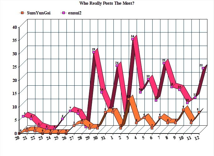
It took me about 5 minutes to make this simple graph to prove you are a liar. LOL.
-

SumYunGai - Permanently Banned
- Posts: 421
- Joined: Fri 29 Jul 2016, 21:02:21
Re: Peakers underestimate TPTB at maintaining the Status Quo
![]() by ennui2 » Tue 13 Sep 2016, 14:12:18
by ennui2 » Tue 13 Sep 2016, 14:12:18
$this->bbcode_second_pass_quote('SumYunGai', '')$this->bbcode_second_pass_quote('ennui2', 'I') could easily chart his posts. He posts more than anyone else. I actually have a fulltime job to tend to, unlike him.
This obviously IS your full time job!
It took me about 5 minutes to make this simple graph to prove you are a liar. LOL.
OK, I was wrong, but you sure as hell SEEM like you post 24/7. I happen to think Adam's treatment of PStarr crosses the line into cyberstalking and generating these charts is equally creepy. This is why you got banned again and again. If you'd rather just take personal pot-shots at people, go someplace else.
There was a time when the moderation of this site decided to strictly enforce a no-ad-hom policy. I'd love to see that happen again. The post count would go down quite a bit but the quality of the disucssion would improve markedly.
The problems here revolve mostly around the free-for-all policy of the mods. You and PStarr's trolling are merely a symptom. Once things descend into the gutter, everyone follows suit (including me). (I wasn't going to have someone like PStarr provoke me with insults about me somehow posting from my mom's basement without giving him some of my own medicine, for instance.) Strict moderation would stop my animated gifs AND stop the petty identity-politics and culture-warrior attacks from you douches in one fell swoop.
And lastly, I could stop posting entirely and Kub and Adam would just keep rebutting your points in my stead. So singling me out is not going to further your cause any. You'll have to also spend just as much time harassing them and Rockdock and anyone else who tries to check your bullshit talking-points.
I'm not your problem. The invalidity of the ETP model is your problem.
"If the oil price crosses above the Etp maximum oil price curve within the next month, I will leave the forum." --SumYunGai (9/21/2016)
-

ennui2 - Permanently Banned
- Posts: 3920
- Joined: Tue 20 Sep 2011, 10:37:02
- Location: Not on Homeworld
Re: Peakers underestimate TPTB at maintaining the Status Quo
![]() by Observerbrb » Wed 14 Sep 2016, 14:42:52
by Observerbrb » Wed 14 Sep 2016, 14:42:52
$this->bbcode_second_pass_quote('ennui2', '
')There was a time when the moderation of this site decided to strictly enforce a no-ad-hom policy. I'd love to see that happen again.
')There was a time when the moderation of this site decided to strictly enforce a no-ad-hom policy. I'd love to see that happen again.
Some people here actually like to discredit other sources, because they have been written by someone they don't like. I am not saying that you should agree with any source, but some forum users should try to make a counter-argument instead of saying "It was written by XX- I don't like XX's views, so this is crap - why should I bother to discuss it?" (a classic ad-hom if you ask me, as I already told you once).
- Observerbrb
- Coal

- Posts: 408
- Joined: Mon 08 Dec 2014, 15:24:48