Peak Oil is You

Donate Bitcoins ;-) or Paypal :-)
Page added on April 30, 2013
Oil Supply and Demand to 2025


Yesterday, we took a look at what 7%ish growth in China’s oil demand would do if continued to 2025 – adding about another 15 million barrels/day (mb/d) to global oil demand. Today, let’s complete the exercise by looking at the other areas of the world where oil demand is growing rapidly, as well as the trends in supply (all data from BP). We will see that things don’t add up
Firstly, here are the developing regions of the world where oil demand was not squelched by the 2005-2008 oil price shock, or the 2008 financial crisis:

It’s easier to see the trends in the individual regions if we show them as separate lines, rather than stacked on top of each other:

Clearly, China is the most important in terms of both level and growth in oil demand, and the Middle East is second.
Now, let’s look at the growth rates (in each case, over the decade prior to the year on the x-axis):

In some cases the growth rate has been dropping on the whole (Asia outside of China), while in others it’s rising (the Middle East, boosted by high oil prices). Regardless, in each case we’ll use the growth rate for the latest available decade (2001-2011), and calculate the incremental demand that each region would require if that growth rate continued to 2025. That looks like this:

There’s about 30mb/d of incremental demand overall, with China accounting for about half of it.
I stress that this is an extrapolation of the recent trend, not a forecast of what will happen. In fact, as we’ll see, this very likely can’t happen.
Let’s now look at global oil production. We’ll stick with the annual data from BP, which includes tar sands and natural gas liquids, in addition to crude oil, but not biofuels. I think that’s a reasonable assumption set over this timeframe – NGLs can be used to fill petrochemical demand that would otherwise have to come from oil, and I don’t think biofuels can grow much more without causing intolerable food price increases (indeed that already started to happen).
Anyway, here’s the data, broken into pre- and post-2005 regions:
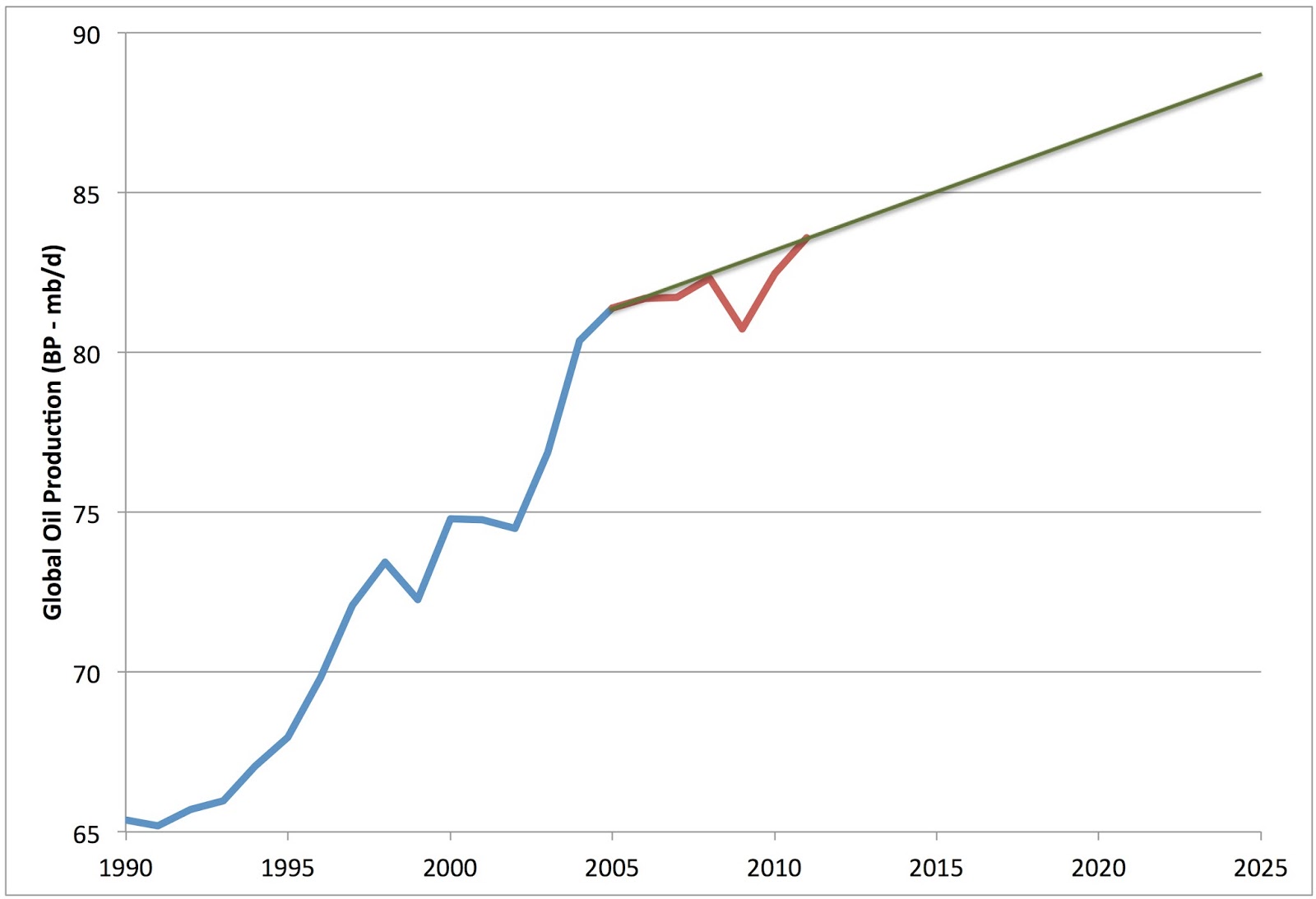
As regular readers know, oil production hit a “bumpy plateau” in 2005, and although oil supply has increased since, the increases have been slow and fitful (red line), and only achieved by much higher prices than were required historically. The green line shows what happens if we assume the existing slope of the plateau continues through 2025. (Ie, this is not a near-term peak oil scenario at all, we are just assuming that the observed rate of increase of the last seven or eight years continues, and whenever oil peaks it is after 2025). As you can see, we only get an extra 5mb/d or so this way. Compare that to the 30mb/d we got by extrapolating the demand of developing regions.
So what’s been making up the difference so far? Primarily falls in oil demand in the developed regions of the world (here taken to be the OECD). If we look at OECD oil consumption from 1990-2025, we get this:
OECD consumption peaked in 2005 (boundary between the blue and red regions of the data), and in my opinion is never likely to reach that level again. Even though global peak oil has not occurred, peak OECD demand has likely occurred given the burgeoning demands in the developing world (peak oil is not synchronous).
The two orange lines show possible scenarios for future OECD demand. The lighter top line shows what happens if we just extrapolate the post 2005 decline. Note that this post 2005 period has not been a great time in the OECD. The US faced an oil price shock followed by a bursting housing bubble, and is still experiencing slow growth and elevated unemployment. Europe is even worse off, with no sign of an end to the recession there, and parts of the periphery experiencing Great Depression levels of economic damage. Meanwhile, Japan has been stuck in permanent economic doldrums since the nineties. Yet, if we continue this trajectory out to 2025, we only save about 8mbd. Add that to the projected 5mbd of new supply, and we’ve only got 13mbd, not 30mbd. To get things to balance purely out of OECD conservation, we need to lop off 25mbd of demand by 2025 (the heavier orange line lower down). That’s a drop of more than half in 13 years.
So it should be clear that something has to give here. Either oil supply has to start growing a lot faster than it has been in the last eight years, or the OECD has to go on a crash conservation program, or developing regions, especially China, have to grow their consumption much more slowly than they did in the last decade (with the oil shock and the financial crisis). Or some combination of all three.
So, either there’s a financial crisis considerably worse than the 2008 one in our future, or we are going to need oil prices considerably higher than we’ve recently experienced to reconcile supply and demand.
10 Comments on "Oil Supply and Demand to 2025"
Plantagenet on Tue, 30th Apr 2013 5:27 pm
Don’t forget that in 2009 Obama promised to fund a “Manhattan-style” project to find a replacement for oil.
Its been four years now—I’m sure we’ll hear what they’ve come up with any day now.
Jerry McManus on Tue, 30th Apr 2013 6:21 pm
Another colossal waste of time from Stuart Staniford. He excels at cherry-picking data to support utterly pointless arguments, but that’s about it.
Linear extrapolations offer absolutely NO insight whatsoever into the dynamics of energy, population, pollution, industrial production, food production, and yes, depletion of non-renewable resources.
Anyone with even rudimentary understanding of stocks, flows, and feedbacks will know that complex systems produce highly non-linear behavior. You would have to be blind or living under a rock not to see that all around us in the various bubbles, booms, and busts of the last few years, just to take one example.
A child scribbling with crayons could do far better than this willfully ignorant and absurdly pointless drivel.
Beery on Tue, 30th Apr 2013 6:45 pm
It’s a trend line, Jerry. Didn’t they teach you about trend lines in whatever passes for schooling in Slackjaw, Mississippi?
LT on Tue, 30th Apr 2013 8:01 pm
This article is in line with the Olduvai theory by Dr. Richard Duncan. Energy per capita will keep diminishing.
Ed on Tue, 30th Apr 2013 10:03 pm
Jerry McManus, in his comment, could not give one concrete mathematical reason why he thought the article wrong. To extrapolate trend lines is a totally legitimate mathematical technique.
What the article is saying is that real life WILL HAVE TO act in a non-linear way if we are to avoid another crisis or very high oil prices. Therefore it has given us a valuable new insight.
GregT on Tue, 30th Apr 2013 10:46 pm
The crisis of 2008 has not ended, it has only been papered over. Kind of like applying a bandaid to a severed artery, eventually it will burst.
Considerably higher oil prices will be in our future, and if $147 bbl seemed bad, just wait, it is only a matter of time before things get a whole lot worse.
BillT on Wed, 1st May 2013 1:43 am
Trend lines are a lazy economist’s way of proving nothing. They no longer apply. Economists can only look back to see ahead. None of their text books mentioned a contracting economy and energy supply so they are lost. Not a mention of the world financial situation OR the fact of climate change. Both have more to do with the future than oil. Oil is a dying industry that is killing the rest.
King Noah on Wed, 27th May 2020 4:14 pm
It’s clear that the author is Adata geek. I like how he writes and also organizes facts.
It’s always a joy to read articles created by real
professionals, such as https://notequaeler.ch/biggest-nfl-player/. I’m fed up with
that no name , ghostwritten articles. This is exactly why
it had been nice to look at a persuasive bit.
I see that the writer has ground knowledge in the topic as well as some experience.
Such sort of information is more valuable compared to copy-pasted posts ideas.
Duncan Idaho on Wed, 27th May 2020 4:46 pm
99,983 deaths
US
Well, according to John Hopkins , we are still under 100,000.
But that is probably not true now.
makati1 on Wed, 27th May 2020 5:24 pm
Duncan, if the numbers were even close to being accurate, the total US deaths FROM COVID-19 are much lower. Then there is the number of people who died WITH COVID-19 but actually died of something else, like a heart attack, that are added to the numbers.
I suspect that this flu is no worse than any other but is being used to gain more power for the government whores/elite. The lock-down was/is a planned test to see how far they can go without triggering a revolt. I hope it is a very, very hot (as in riotous) summer in Amerika. Maybe they should lynch real politicians and not effigies. This is far from being over. Sigh!