Peak Oil is You

Donate Bitcoins ;-) or Paypal :-)
Page added on April 8, 2011
Stuart Staniford: Will China Slow Down by 2015?


A new paper was released by the prestigious National Bureau of Economic Research a few days ago. The authors are well known and work at distinguished institutions: first author Barry Eichengreen is a widely cited expert at UC Berkeley, Donghyun Park is at the Asian Development Bank, and Kwanho Shin is at the Korea University in Seoul. The paper was approvingly cited by savvy bloggers like Kevin Drum and Ryan Avent at the Economist’s Free Exchange blog. Here’s what the abstract says:

However, I downloaded the paper (paying my $5 in the process) and read it. And I think the data analysis is deeply flawed and the paper’s conclusions are wrong. Let me try to explain what the paper is saying and why you should pay attention to me, instead of to its prestigious authors.
First, let me be clear that I completely agree with the basic conceptual worldview of the paper:

I don’t have any problem with this characterization for why late developing countries can grow faster than already industrialized countries, or that this process must end. I agree that countries like Japan, Korea, and Taiwan can be considered to have gone through this process, and are worth studying as analogies. I agree that the question of when this kind of slowdown will come to China is an extremely important question. My problem is with the way they go about trying to answer it.
What they do is to go through at database of country level GDP data back to 1950 (the Penn World Tables) and look for situations like the following:
- Countries that had a growth over 3.5% for an interval of seven years
- Followed by an interval of growth at least two percentage points lower for the following seven years.
- Which ended up with a GDP/capita of at least $10k/yr (in 2005 prices).
This sounds superficially reasonable. The sample they end up with is listed in their Table 1, and to give you a flavor of it, here’s the start of the table (which goes on for another five pages):

Then they look at the income levels that each country was at when the growth slowdown happened. They throw out the oil exporters as being driven by different dynamics (as I will also). Then they construct the following histogram:

This is where the $17,000 average level in the table comes from (they don’t label the x-axis, but it’s per-capita GDP). And once they have that, it’s straightforward to see that China will cross that level in about five years, the most striking claim in the abstract.
To see the problems with what they are doing, let’s start by taking all the countries in their Table 1 sample and plotting their real GDP/capita over the entire 1950-2009 interval that the Penn World Tables presently have:

Here I have added China to their sample as the heavy red line at the bottom (that’s the one where we are trying to figure out what will happen). I have also made the US a heavy black line to be easier to see. Note that the US is in their sample, which should immediately give you pause, because I think we should view the US as essentially having been at or near the current technological productivity frontier at all times since the second world war. I have also marked with a green horizontal dotted line the approximate $17k/capita level that they say is the average of the growth slowdowns. A red vertical line is at 2015, where they say China is probably going to experience the same thing.
To illustrate some of the problems with their sample and procedure, I have removed all but three of the cases (also leaving in the US and China for comparison). I am also marking with a purple circle some of their growth slowdowns. These examples are not exhaustive of the issues with the sample, but are intended to illustrate a variety of classes of problems:
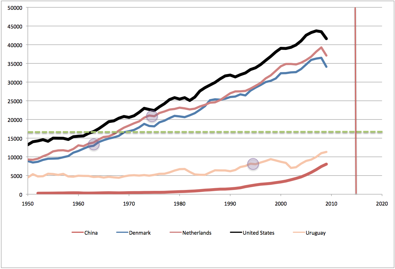
First, let’s talk about Denmark (the blue line). Eichengreen et al have a slowdown in Denmark in the years 1964/1965 in their sample. Now, I’m not disputing that growth slowed down, but let me point out that this was a full fifty years before 2015. Are we really sure that GDP/capita in Denmark in 1965 tells us a lot about GDP/capita in China fifty years later? In particular, note that US GDP/capita has increased by a factor of close to three over the intervening time: there have been enormous increases in productivity in 50 years, and this means that a GDP/capita of $13,944 (in 2005 dollars) in Denmark in 1965 means something completely different than $13,944 (still in 2005 dollars) would mean today. The same income level is a lot further from the technological productivity frontier today than it was then. Nonetheless, they are including that data point in their sample.
Furthermore, Denmark, like another of my problematic cases, the Netherlands, is really not a very persuasive story of being a fast growing developing country that hit the limits of their ability to play catchup with the advanced countries. Places like the Netherlands were already advanced countries in 1950, and the ratio of their GDP/capita to that of the US is relatively constant over time. The Netherlands gets into the sample because of a growth slowdown in the early 1970s – three years are in the table in 1970, 1973, and 1974. I have circled 1973/1974 as the most visible setback in the GDP/capita line. But again – this is not a fast developing country hitting the limits of its ability to over-invest in catchup – there was an oil shock in 1973! This is a story, like most of the advanced countries, of an oil-shock inducing a recession and a slowdown in growth. Again, this can’t possibly tell us much about the income level when China will hit the limits of catch-up.
Finally, Uruguay (the sort of peachy colored line), which is listed for a slowdown in the mid 1990s. The problem here is that Uruguay is a completely unpersuasive analogy for what is happening in China. Uruguay starts and ends the sample as a lower-middle income country, and has never had an extended period of growth anything like the 10%/year level we’ve seen in China in recent years.
To try to get a better grip on the situation, I did two things. Firstly, to formalize the instinct that the US has been at/near the productivity frontier at most times, I expressed every country’s GDP/capita as a fraction of the US value in the same year. Then I started kicking countries out of the sample, unless they met the following criteria: they started out the sample clearly less productive than the US (I took less than 60% as my threshold), and ended up significantly more productive, relative to the US, than they had started out. Ie, we want countries where it’s somewhat plausible that there’s a story of underdevelopment, period of rapid catchup, followed by slowing growth once the country is a fully developed country with modern capital infrastructure and levels of productivity.
That gives me this (much smaller) sample:
You can see that the sample consists of two main classes:
- mostly central and southern European countries that were somewhat more rural than the US or northern European economies in 1950, grew faster than the US in the 1950s and 1960s, and then slowed down to a similar pace of growth
- Asian countries that grew very fast somewhat later, but have slowed since (places like Japan, Korea, Taiwan, etc).
In that last figure, I also show (red dotted line) what happens if you extrapolate China’s growth relative to the US for the next decade at the same pace as over the last ten years (a shade over 9%/year). You can see that by 2020, they are just getting to the lower end of the range. They will not be very close to it in 2015, contrary to what Eichengreen et al are saying.
As for the rest of the Eichengreen paper — a bunch of regression experiments on their sample to find out what else influences the level of growth slowdown — I won’t deal with it in detail. If the sample is deeply flawed and the dependent variable is completely inappropriate, who knows what they’ll find once they start plugging lots of things into the statistical black boxes, but it’s not likely to be much in the way of insight.
Finally, I want to stress one thing: I am not saying China will definitely continue growing at breakneck pace for another decade plus. I think there are profound risks to that possibility: it seems very likely that so much growth in that large a country will trigger more big resource price shocks, which will slow China as well as everyone else. Plus, we are already at the point where it seems like it’s only a slight humorous exaggeration to say that everything in Walmart and Home Depot comes from China, and it’s not at all clear that they can continue to increase their exports at the recent pace for another 10-15 years. Furthermore, there are obviously large internal political risks in China’s authoritarian system. What I’m saying instead is this: if they slowdown before something like 2025, it’s very unlikely to be due to the fact that they’ve reached close enough to developed country productivity levels that they can no longer do fast catch-up growth. The reason will be different.
One Comment on "Stuart Staniford: Will China Slow Down by 2015?"
Kenz300 on Sun, 10th Apr 2011 3:13 am
With the increasing price of oil will the world continue to ship goods around the world that they can make at home? It will get awfully expensive to ship those shipping containers and move the goods in trucks when the price of oil hits $150/barrel. We will see what happens this summer as the price of oil rises for the summer driving season what impact the price has on consumers. Those supply chains have been disrupted by the disaster in Japan. Now with rising oil prices will that be enough to bring some manufacturing jobs back home? High oil prices may be what impacts China growth going forward.