

PeakOil is You
OilFinder2 please summarize your finds
OilFinder2 please summarize your finds
![]() by Keith_McClary » Sat 30 May 2009, 00:11:13
by Keith_McClary » Sat 30 May 2009, 00:11:13
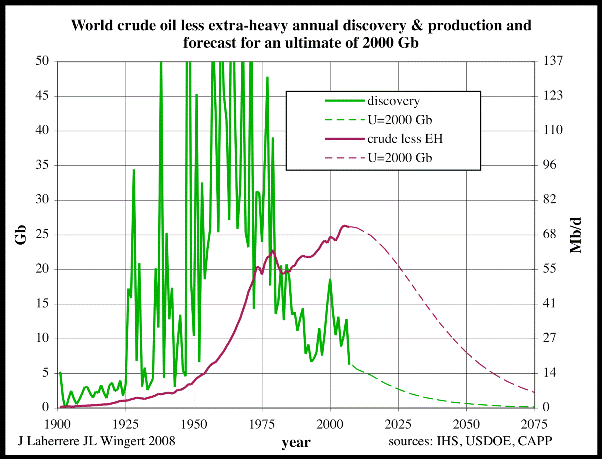
We appreciate all the work you do to cut'n'paste all these corporate press releases about stupendous gushers, but it's a bit overwhelming. How about summarizing your findings in a table or graph, something like this one by "ace" at the Oil Drum:
Facebook knows you're a dog.
-

Keith_McClary - Light Sweet Crude

- Posts: 7344
- Joined: Wed 21 Jul 2004, 03:00:00
- Location: Suburban tar sands
Re: OilFinder2 please summarize your finds
![]() by shortonsense » Sat 30 May 2009, 01:02:29
by shortonsense » Sat 30 May 2009, 01:02:29
$this->bbcode_second_pass_quote('Keith_McClary', 'W')e appreciate all the work you do to cut'n'paste all these corporate press releases about stupendous gushers, but it's a bit overwhelming. How about summarizing your findings in a table or graph, something like this one by "ace" at the Oil Drum:
You want Oilfinder to design a graph for you which excludes lots of oil so he can show something in biased way? Why would he want to do that? I think he has been doing pretty good including everything he can find, and busting the entire myth of "we use more than we find!!" without too much trouble.
Why can't he just make a graph which includes all the finds rather than one of these "exclude everything possible to try and score a point" graphs?
-

shortonsense - Permanently Banned
- Posts: 3124
- Joined: Sat 30 Aug 2008, 03:00:00
Re: OilFinder2 please summarize your finds
![]() by copious.abundance » Sat 30 May 2009, 01:15:37
by copious.abundance » Sat 30 May 2009, 01:15:37
After each year I *have* made summaries in my Catalog thread. Plus this year and last year I started doing running totals after each discovery.
I don't feel like making any graphs. Sorry. Here is a quick look at my yearly totals:
------------------------------------------------------------
Total 2006: 10.65 - 25.9 billion barrels.
This gives us a mean value of 18.27 billion barrels.
------------------------------------------------------------
Total 2007: 32.32 billion - 36.85 billion.
This gives us a mean value of 34.58 billion barrels.
------------------------------------------------------------
Total 2008: 24.009 billion - 27.758 billion.
This gives us a mean value of 25.88 billion barrels.
------------------------------------------------------------
For 2009 I have added a new feature separating (where I can) OIP from recoverable figures. Do not assume the recoverable is a sub-set of the OIP, they are totally separate and have little to do with each other.
Recoverable running total year to date: 1.548 billion barrels minimum to 3.476 billion barrels maximum
OIP running total year to date: 5.515 billion barrels minimum to 7.01 billion barrels maximum
------------------------------------------------------------
That's my info. If someone else wants to make a graph, go ahead.
Stuff for doomers to contemplate:
http://peakoil.com/forums/post1190117.html#p1190117
http://peakoil.com/forums/post1193930.html#p1193930
http://peakoil.com/forums/post1206767.html#p1206767
http://peakoil.com/forums/post1190117.html#p1190117
http://peakoil.com/forums/post1193930.html#p1193930
http://peakoil.com/forums/post1206767.html#p1206767
-

copious.abundance - Fission

- Posts: 9589
- Joined: Wed 26 Mar 2008, 03:00:00
- Location: Cornucopia
Re: OilFinder2 please summarize your finds
![]() by AirlinePilot » Sat 30 May 2009, 01:21:21
by AirlinePilot » Sat 30 May 2009, 01:21:21
$this->bbcode_second_pass_quote('shortonsense', 'W')hy can't he just make a graph which includes all the finds rather than one of these "exclude everything possible to try and score a point" graphs?
Oh come on. Please enlighten us all on how that graph( ace aint the only one coming up with very similar data) does anything you claim. Show your work please. I'm tired of this crap here. What sources are you using to claim things are different? Attacking "doomers" isn't sufficient anymore. You need to prove how the graph is wrong. Do that or STFU.
Since when in the history of oil exploration and production have "all the finds" resulted in the same amount produced that was claimed? Careful, your naivete is showing.
-

AirlinePilot - Moderator

- Posts: 4378
- Joined: Tue 05 Apr 2005, 03:00:00
- Location: South of Atlanta
Re: OilFinder2 please summarize your finds
![]() by copious.abundance » Sat 30 May 2009, 01:26:54
by copious.abundance » Sat 30 May 2009, 01:26:54
BTW, I would like to add a comment . . .
As I have done this over the past few years (especially starting last year), I have gotten "better" at finding these things. Particularly in 2006, I did not search as extensively as I did in 2007 and, especially, 2008. So particularly in 2006, there are going to be ones I missed - but I *know* there are still many I do not catch even nowadays, because there are so many discoveries made whose resource sizes are not announced until years after the discovery is made, and then they get buried in corporate quarterly or year-end statements. I've discussed this at length in my catalog thread. I am particularly frustrated with my inability to find discovery sizes in Angola, where LOTS of discoveries have been made over the past several years.
On the other hand, in 2006 and 2007 I listed a few discoveries which, in hindsight, I probably should not have listed. I'm particularly thinking of a "discovery" in Tanzania which I now realize was just an estimate from seismic readings. Probably a few others I should have waited for more information on. This, fortunately, I have avoided doing in 2008 and this year. Essentially, my methodology has gotten better over time.
But I also tend to think the faults of my methodology in 2006 and 2007 probably balance out. While I included some I probably should not have, I also missed many. If you want to, you can take 2006 and 2007 with a grain of salt. 2008 and 2009 are much better.
I would go back and do some editing of 2006 and 2007, but those were in my old account and I cannot log in under that account anymore. But anyway, as I said, given the balancing faults it's probably "good enough."
Stuff for doomers to contemplate:
http://peakoil.com/forums/post1190117.html#p1190117
http://peakoil.com/forums/post1193930.html#p1193930
http://peakoil.com/forums/post1206767.html#p1206767
http://peakoil.com/forums/post1190117.html#p1190117
http://peakoil.com/forums/post1193930.html#p1193930
http://peakoil.com/forums/post1206767.html#p1206767
-
copious.abundance - Fission
- Posts: 9589
- Joined: Wed 26 Mar 2008, 03:00:00
- Location: Cornucopia
Re: OilFinder2 please summarize your finds
![]() by copious.abundance » Sat 30 May 2009, 01:40:35
by copious.abundance » Sat 30 May 2009, 01:40:35
$this->bbcode_second_pass_quote('OilFinder2', 'P')articularly in 2006, I did not search as extensively as I did in 2007 and, especially, 2008. So particularly in 2006, there are going to be ones I missed - but I *know* there are still many I do not catch even nowadays, because there are so many discoveries made whose resource sizes are not announced until years after the discovery is made, and then they get buried in corporate quarterly or year-end statements.
BTW, here's a PERFECT example of this: Someone find for me an official statement from BP telling us the size of the Thunder Horse field. Unofficial estimates from various sources do not count (I have seen 1 billion - 1.5 billion barrels). Keep in mind this was discovered in 1999 and is now in production. It is now 10 years later, and an official statement still has yet to be made (at least, that I can discern or find).
In other words, if I had started my catalog in 1999, Thunder Horse would still not be cataloged. This is one example of how I am absolutely certain there are a lot of discoveries made that I miss (and likely will never find).
Stuff for doomers to contemplate:
http://peakoil.com/forums/post1190117.html#p1190117
http://peakoil.com/forums/post1193930.html#p1193930
http://peakoil.com/forums/post1206767.html#p1206767
http://peakoil.com/forums/post1190117.html#p1190117
http://peakoil.com/forums/post1193930.html#p1193930
http://peakoil.com/forums/post1206767.html#p1206767
-
copious.abundance - Fission
- Posts: 9589
- Joined: Wed 26 Mar 2008, 03:00:00
- Location: Cornucopia
Re: OilFinder2 please summarize your finds
![]() by Blacksmith » Sat 30 May 2009, 03:39:18
by Blacksmith » Sat 30 May 2009, 03:39:18
Why you guys even bother with this A-hole is beyond me.
Employed senior
- Blacksmith
- Heavy Crude

- Posts: 1064
- Joined: Sun 13 May 2007, 03:00:00
- Location: Athabasca, Alberta
Re: OilFinder2 please summarize your finds
![]() by kiwichick » Sat 30 May 2009, 04:24:52
by kiwichick » Sat 30 May 2009, 04:24:52
before Copurnicus earth was the center of the universe
before columbus the earth was flat
before the wright bros ( and richard pearse for the kiwis) if man had been meant to fly god would have given us wings
before darwin god created the world in 7 days
before einsten; newton; rutherford etc
we are still burning 70 million barrels of crude every day
and adding 60+ million GHG emitters to the population each year
-

kiwichick - Intermediate Crude

- Posts: 2267
- Joined: Sat 02 Aug 2008, 03:00:00
- Location: Southland New Zealand
Re: OilFinder2 please summarize your finds
![]() by JohnDenver » Sat 30 May 2009, 06:37:18
by JohnDenver » Sat 30 May 2009, 06:37:18
$this->bbcode_second_pass_quote('Keith_McClary', 'H')ow about summarizing your findings in a table or graph, something like this one by "ace" at the Oil Drum:
That graph isn't by "ace". It's by J. Laherrere - you can tell by the style, and the lower left corner.
- JohnDenver
- Intermediate Crude
- Posts: 2145
- Joined: Sun 29 Aug 2004, 03:00:00