Peak Oil is You

Donate Bitcoins ;-) or Paypal :-)
Page added on September 8, 2013
IEA Sankey Diagrams

The International Energy Agency has taken its share of abuse from The Oil Drum over the years for its rather optimistic forecasts. But it deserves a hearty shout-out for an invaluable resource it has on its web site: Interactive Sankey Diagrams for the World.
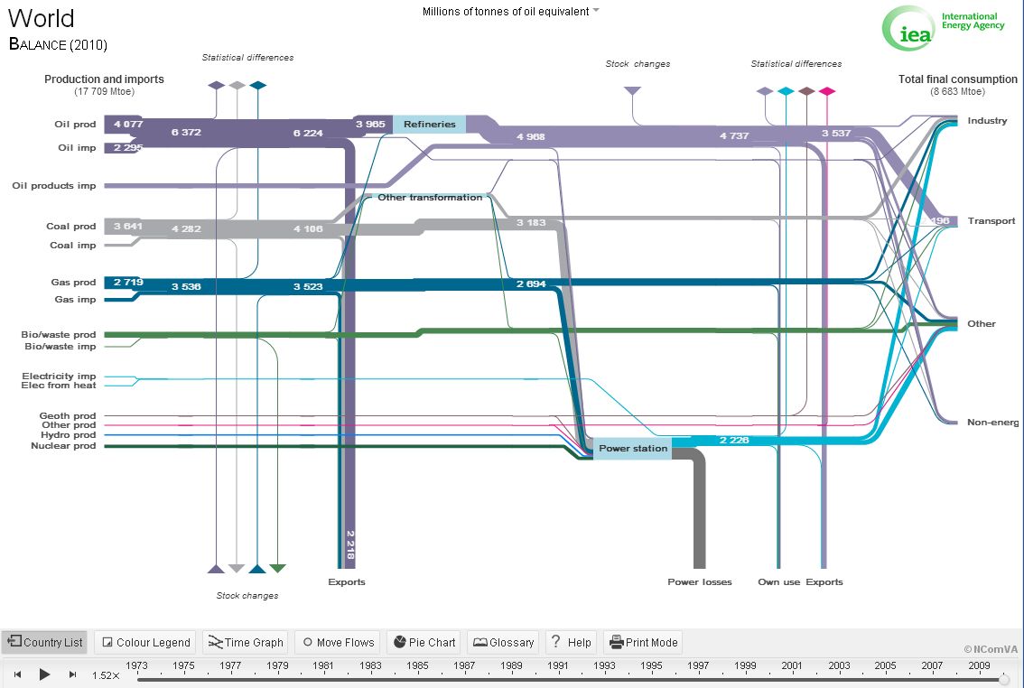
Sankey Diagram showing world energy flows (Click for larger view) |
As long as you understand what a Sankey Diagram is, not much more introduction is needed here. You can look at individual countries, consumption patterns as well as production, and more. Click on individual flows and graph over time.
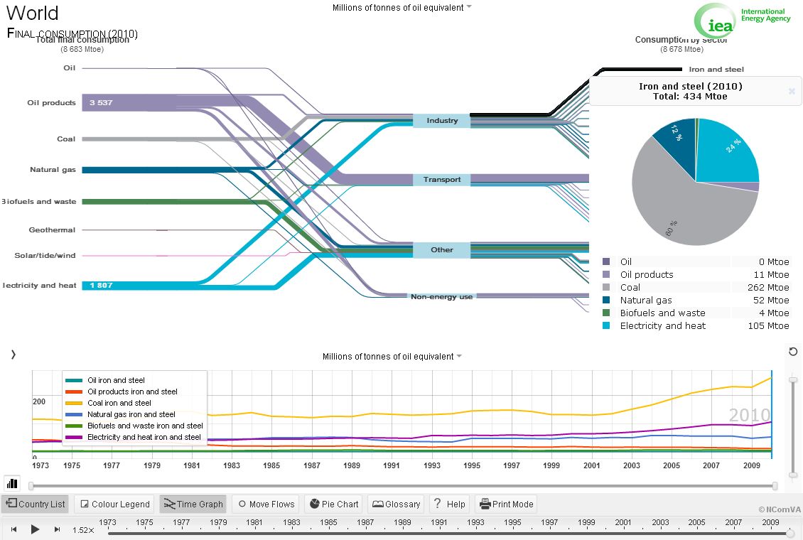 World energy use for steel production (Click for larger view) World energy use for steel production (Click for larger view) |
One curiosity, though:
The world oil imports (2295) and oil exports (2218) don’t match in the top graphic. “Statistical difference”?
As with data from the BP Statistical Review series, there might be occasional quibbles with the numbers. Also, I’ve seen prettier Sankeys. But if you’ve been wondering what to do with all of your time after The Oil Drum goes on hiatus, there you go.
One Comment on "IEA Sankey Diagrams"
diemos on Sun, 8th Sep 2013 5:38 pm
Where exactly does the world import oil from? have we finally opened up the methane mines on titan?